- DCIM?
- What is DCIM?
- What is a Colocation Data Center?
- What is the Federal Data Center Optimization Initiative (DCOI)?
- What is Data Center Management?
- What is Second-Generation DCIM?
- What is Data Center Monitoring?
- What is Data Center Service Management (DCSM)?
- What is Network Documentation?
- What is an Edge Data Center?
- What is a Data Center CMDB?
- What is Data Center Automation?
- How do I get started?
- Products
- Service
- Resources
- Support
- Company
- Search

Visualization
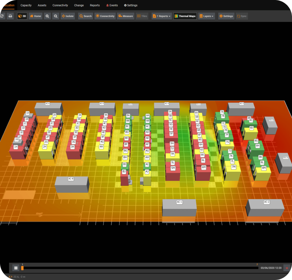
A 3D digital twin of your data center.
Built-in thermal and pressure maps with time-lapse video.
- Forecast and address changes in your data center environment with speed and accuracy.
- Spot temperature and humidity trends over time across your entire data center floor map
- Identify and predict hotspot formation—from start to end points
- Works with environmental sensors already deployed in your data center for easy data collection and high-quality data
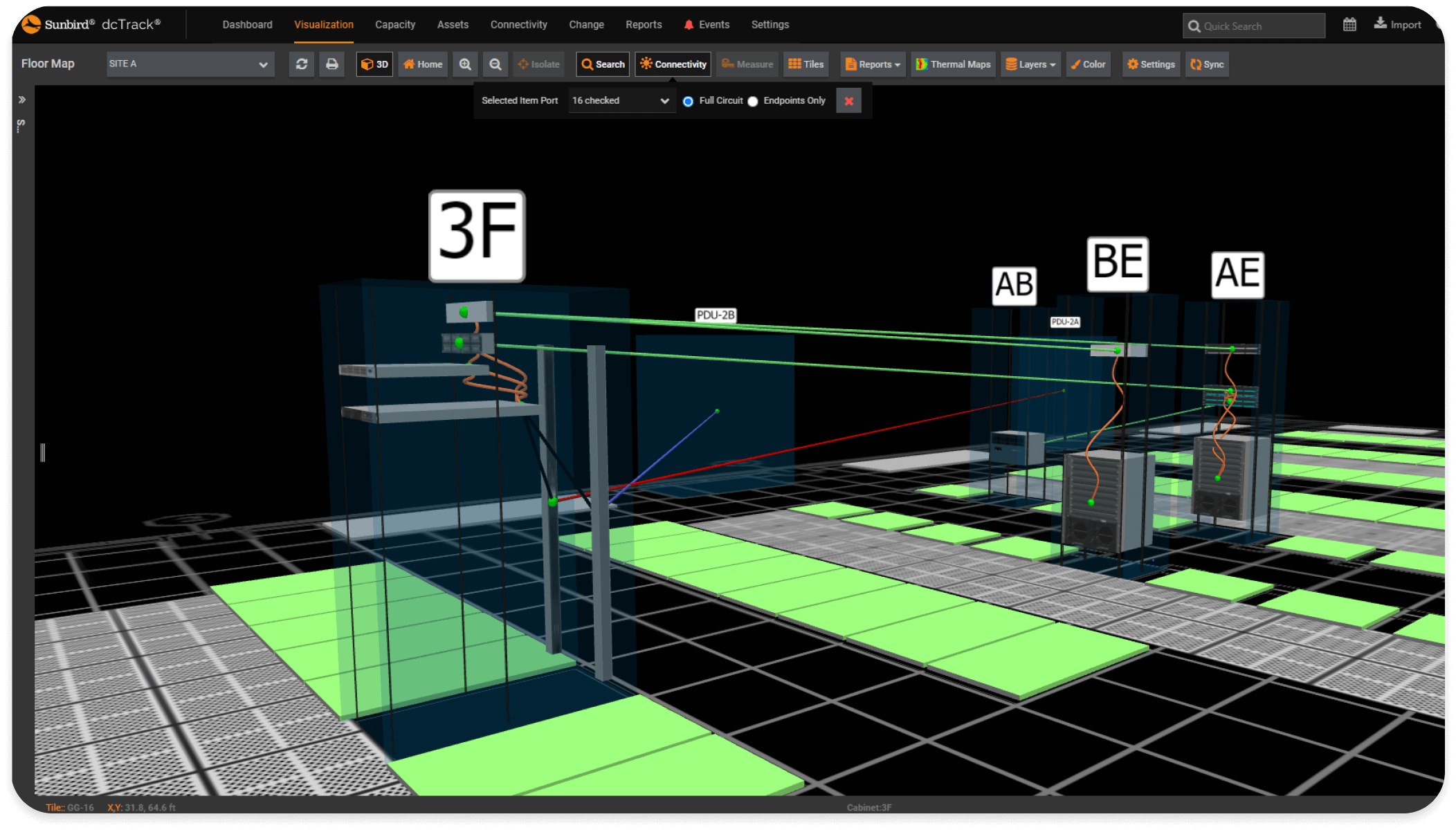
3D visualization of all power and data circuits, hop by hop.
- Color-coded hop-by-hop cabling that matches your environment and enables quick visualization of path types (e.g., red vs. blue for A vs. B power paths)
- Visual dependency and redundancy mapping
- Visual troubleshooting of all power and data circuits
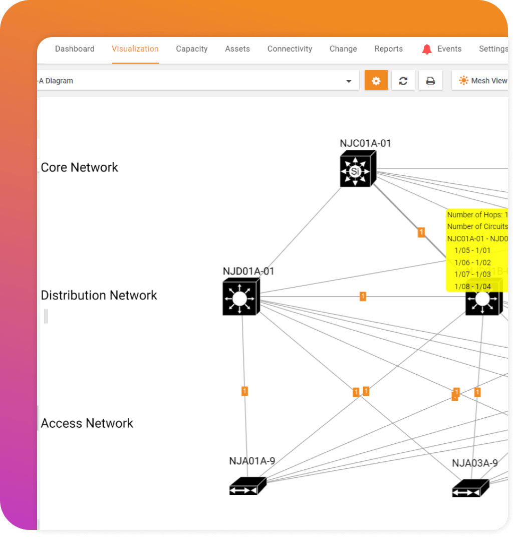
Automatic network diagrams that include structured and patch cabling
- Visualize what's connected to what across both active and passive components
- Decrease time spent troubleshooting and planning
- View in tiered or mesh mode, display nodes as shapes, icons, or model images, and color code nodes based on their attributes
Google earth meets your data center.
All sites globally mapped and at your fingertips: data center, colo, edge/pops, and closets.
See the health and power capacity of all your sites on a world map
Navigate all your sites with just your internet browser and drill down to get a bird's-eye view of the entire data center floor or take a closer look at specific aisles and cabinets
Rotate, pan, and zoom the entire floor or isolate rows and containment aisles
Be the superman of your data center.
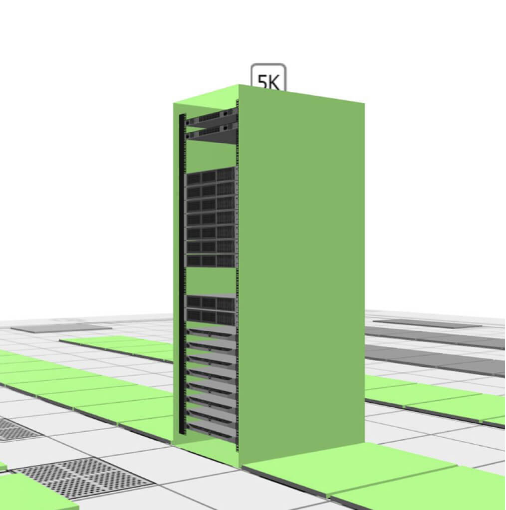
- “X-ray” views enable you to see inside your cabinets
- Easily visualize the impossible: side views of all your racks without the side panels.
- Flip from the front to the back of your row with superhuman speed
- Enhance your vision with detailed model, depth, alignment, and mounting information as well as sensor data for your devices
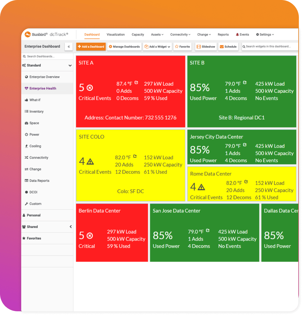
Feel better and sleep better.
Knowing that Sunbird DCIM is continuously monitoring the health and status of all your data centers.
- Easily see the health of all your sites in one view with simple red-yellow-green color-coding
- Quickly drill down to understand all monitored power and environment events that trigger threshold alerts
- Rapidly sort, filter, and clear all of your events in a single view
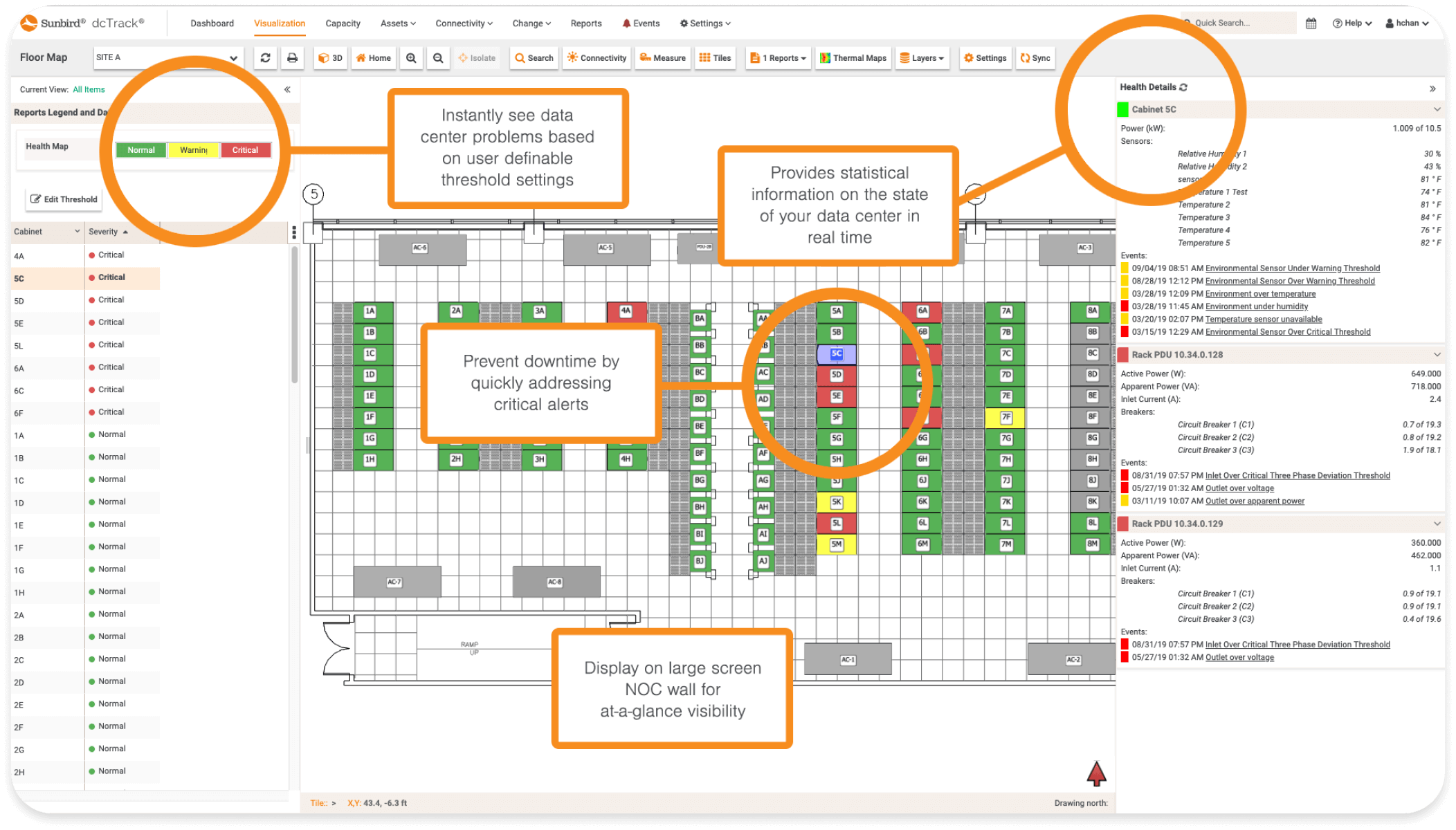
Interactive data center health map.
Real-time interactive data center floor map provides color coded bird's eye view of key data including active power, current & capacity, temperature, humidity, air flow, differential pressure and events on per cabinet basis. Pinpoint the source for threshold alerts and events as well as rack PDU performance.
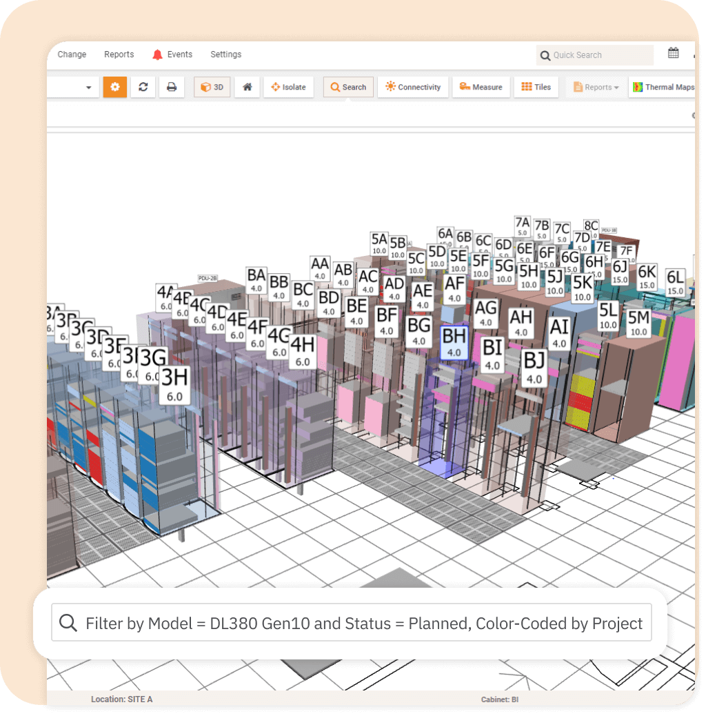
Visual search of any asset attribute on your entire data center floor.
- 3D visual search with multi-filter capability
- Color-coded visual results by any attribute to easily see and communicate to teams and management
- Exportable list of search results


